Where to begin? I haven’t written much software since I retired 2 years ago. I was inspired a few months ago to create a VSCode extension for generating music charts, which I had a lot of fun building. To be fair, GitHub CoPilot did most of the building after I corrected a few of its early errors. And amazingly enough, in a couple of weeks I was producing polished charts suitable for a band to play from (my band, but that’s another story).
That effort scratched a long time irritation I’ve had with music charts. But honestly I haven’t thought much about really doing anything serious with software since I retired. At least not until I read this article about Jesse Genet and her OpenClaw agent system. It was a fascinating read. The idea that someone set up a home system to do something for them was, well, inspiring. To me this is the promise of AI – not replacing my search engine but actually being helpful, taking on tasks that I would otherwise have to do and ultimately reduce my cognitive load.
Today, everyone use AI tools – ChatGPT, Claude, CoPilot, Perplexity, Gemini – and the list goes on. But mostly what we do with them is ask questions or feed them materials and wait for results. Admittedly, that’s mostly what I do as well. But the promise of AI is much more than that.
Businesses are starting to get the hang of it with AI call handling, customer support, and some back office functions. But I remember way back in 1984 when a small company called Apple released the computer for the rest of us – the Macintosh. When it first came out, with its black-and-white WYSIWYG screen, the thought was that these computers would live in our kitchens, pulling up recipes, family calendars and contacts, notes and reminders. But that wasn’t enough for the Mac to be successful. Instead someone developed FrameMaker, the first desktop publishing software, which essentially transformed the Mac from a true “home” computer into a somewhat specialized “business” computer. Today, that’s largely how Macs still sit – they target content creators (which is sort of a business application) and software engineers (who love the BSD base that MacOS is built on). PCs, on the other hand, largely followed the work at home track – they were used in business and people bought them for the homes so they could work at home.
There’s really a point here that I’m taking a long time to make – it’s going to be a long time until we get personal assistants that are really personal, not about business. There’s a good argument that maybe we don’t need it. But I decided to test that theory to see if I could build a system that actually improved my life by unburdening me.
I started setting up OpenClaw a little over a week ago and have made some quick progress. I’ve taken atypical approach to the setup because of my bias against running servers in my home. So for starters, my OpenClaw system lives on an Ubuntu VM in Azure. I’m also a cautious builder – I’m not quite ready to trust anything it does so I’m engineering it with safety and security in mind. I’m willing to spend the money on tokens up front but that won’t last forever – it ultimately has to be cost effective.
Most important, it has to do things for me that I would otherwise have to do. It’ll be a long haul project – I don’t simply want scheduled tasks that repeat themselves. I need things to be done without my intervention, except for perhaps approvals. My model is that of a chief of staff. A good chief of staff knows what it can handle on my behalf without approvals and what it can do with my approval. But more importantly, it can anticipate my needs and act to satisfy them.
Go big or go home, as they say. I’ve been fortunate in my first week of having a significant “Eureka!” moment that gave me hope that I wasn’t aiming too high. The next post will talk more about how I’ve approached this and what I’ve put together.
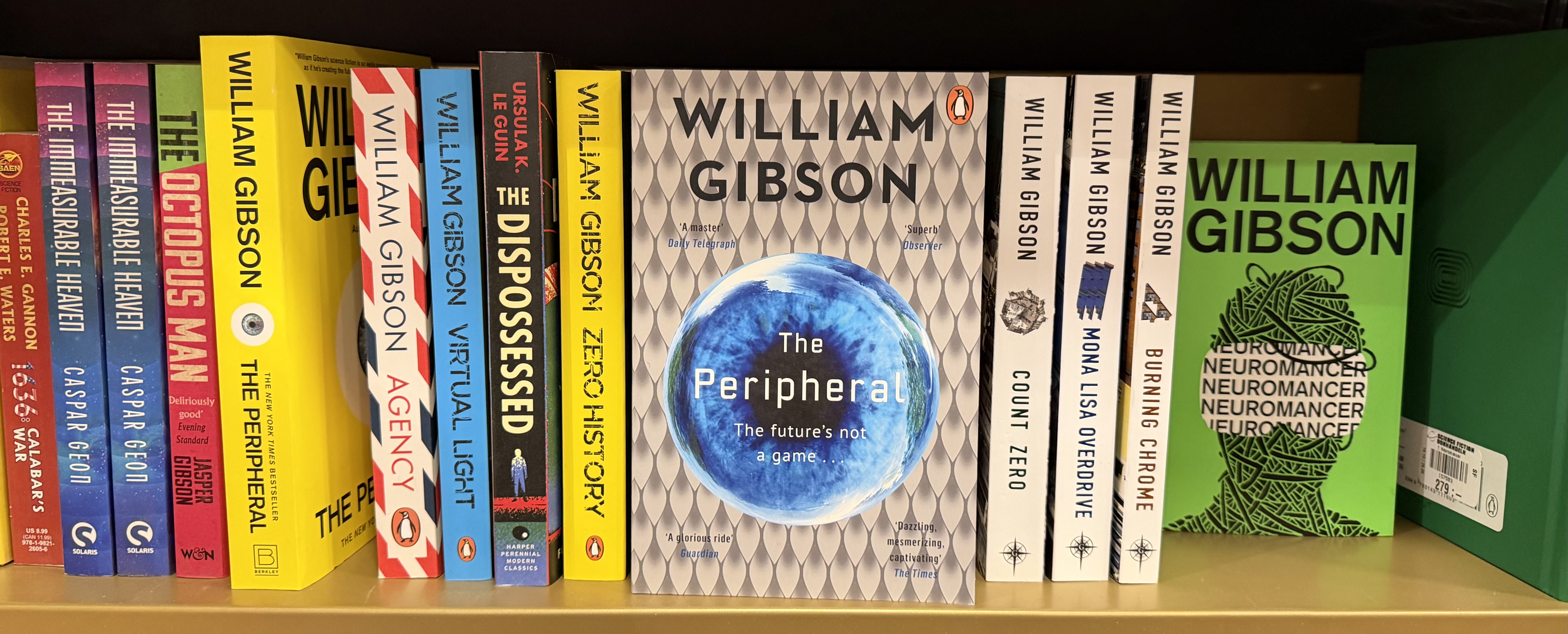
“Lead the way then, Mr. Netherton,” said Lowbeer.
Netherton did, imagining, as he climbed the stairs, a better world, one in which a relaxing drink would be waiting in the sitting room.
— from “The Peripheral” by William Gibson